Be Your OWN Color Stylist

color-wheel


An Experts Opinion

If you feel you need an expert’s opinion, find a color analyst and spend the money to have your colors done. Having done that, if the colors don’t appeal to you, don’t be surprised. Color analysis is not an exact science. I have worked with many women less than happy with their clothes only to discover that their color analysis was wrong and their problems were solved by returning to the colors that appealed to them.

You DO Know Best
You are the best analyst of what does and does not look good against your face – you’ve live with it the longest! Spending a couple hour playing with colors is the best to determine what color scheme works best for you. You will often find that it is not the actual colors you select but rather the tones/hues of the colors that work or don’t work. So find the colors that appeal to your personality the best and check out what shades and hues of those colors look the best

Do The Analysis
Make a trip with a close friend or someone versed in the color arts (painter, jewelry designer, interior decorator,a friend that dresses like a million, etc)and a mirror to a fabric store. Stroll the aisles and drape various solid colored fabrics around your shoulders and see what makes your face the most vibrant. You will see a pattern emerging.
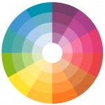
Color Seasons
Summer

Pastels and light colors. Navy and off-white look great. Pure white looks icy and not the best. Denim looks great. Except for orange, that makes you look sick, just about any color in the pastels looks great.

Great neutrals are navy, off-white and a grayish brown.

Rule of thumb: Stay light and pastel like the late summer afternoons.

Spring

Bright vivid colors look best against your face. Bright medium hued colors look great. Often patterns that work will have bright colors on a black background. Periwinkle blue or blue purples look great as do peaches and melons.

Great neutrals are off-white, white, black, light navy, and yellow browns.

Rule of thumb: Follow springs lead with all the bright colors of blossoming flowers.

Autumn

Earth tones and the colors of fall. Navy blue and aqua work well. Mixing yellows into the primary colors and softening them slightly works the best. You will like yourself better in gold rather than yellow. Orange looks good and melon is your ‘pink’.

Neutrals best for you are the medium shades of navy blue and a bronzy brown.

You will find yourself gravitating to a monochromatic or analogous color schemes – multiple shades of a color work beautifully.

Rule of thumb – Follow natures lead with the earth tones or autumn.

Winter 

The primary shades look best. Dark red and navy look good next to your face. Pastels make you look faded. Give them an icy, shimmery white tone or overlay them with white lace and they look great. Dark pink or salmon gold work nicely as do forest greens. Black/white combos work for you. They are more than neutrals to you – they are colors. The colors you like are the ones that stand out in a crowd. That is part of your color personality.

You gravitate to a two color theme. Adding an additional color loses the drama.

Neutrals are where you will shine. Dark gray with a touch of silver or the reverse. Navy and dark brown. And, always, black and white.

Rule of thumb – Like the season, pure, clear, and intense.

A Little More Exploring

If you want to explore a little more about color and get a color sample card to keep with you when shopping head over to the IstinaDesign Shop and check out the Understanding Color Module on sale there.

Have Fun

Enjoy the process and find the inner you!

Facebooktwitterpinterestlinkedin

There are no comments right now.


The Colors of Spring 2015

Introducing the Colors of Spring 2015

2015-Colors-of-the-Year-Istina-Design

In addition to their color of the year, Marsala, Pantone has also published the expected colors for the spring – or at least the colors the large designers will be making their collections in.

I Think They’ve Got It!

This year I think they got it! According to Pantone, “Many feel compelled to be connected around the clock because we are afraid we’ll miss something important. There is a growing movement to step out and create ‘quiet zones’ to disconnect from technology and unwind, giving ourselves time to stop and be still. Color choices follow the same minimalistic, ‘en plain air’ theme, taking a cue from nature rather than being reinvented or mechanically manipulated.”

Soft and Natural

While the colors this season are soft, they are not the frilly romantic pastels of years past. Interestingly all of the top four colors are in the blue family and provide a color good for each color season:a soft Aquamarine for the Autumn color group, Scuba Blue for the Summer colors, Lucite Green (a greenish blue) for the burst into spring colors and Classic blue for the Winters among us. While each of the colors selected is a strong color and can stand alone, they are all soft gentle natural hues.

Winter Intense?

If you are looking for intense colors (as a lot of Winters are) then this years palette will be challenging. Combine any of these colors with black in your outfit and you will get back that intensity.

Inviting

They are colors that invite you to find out which one looks good on you. None of them demand centerstage. Now is a good time to go exploring in a fabric store to see what colors look good against your complexion.

Create Your Own Color Palette!

Throw out all your understanding of who should be what color group and the myriad of rules of what you should and should not wear. Explore and find the colors that make you smile when you wrap them around your face and create your own palette for your clothes.


Facebooktwitterpinterestlinkedin

There are no comments right now.


Pantone’s Color of 2015 – What do you Think?

Marsala

Earlier this month, Pantone announced what it expects to be the color of the year for 2015. Of course, by announcing it, it becomes a self-fulling action. Clothing designers wait for and design to that color and flood the market with myriads of designs employing that color. It is up to us as consumers to  determine if that color is indeed appealing for the year.

Pantone’s Selection for 2015

This year their selected color is described as Marsala. Fancy name for a reddish brown. They describe it as “Sensual and bold, delicious Marsala is a daringly inviting tone that nurtures; exuding confidence and stability while feeding the body, mind and soul. Much like the fortified wine that gives Marsala its name, this robust shade incorporates the warmth and richness of a tastefully fulfilling meal, while its grounding red-brown roots point to a sophisticated, natural earthiness.”

Will It Work For You?

If your color analysis says you are an Autumn then this color is fantastic for you. It is the perfect neutral for your wardrobe.

Spring and Winter – not so much. Unless you use it as an accent or change its tone in some way it will make you look washed out and ill.

Summers might be able to get away with lightening it up.

What Do You Think?

What do you think of the color? I’m interested to see just how accurate Pantone is in predicting our color likes. Let me know with a comment.

More Info

For more information on understanding your body shape and what looks great on you go to my website Istina Design.

Above all, don’t pick a color because someone in authority tells you it is the in color. Pick colors that you enjoy and that make you feel like a million.


Facebooktwitterpinterestlinkedin

There are no comments right now.


Trunk Shows

To avoid the major markup that retail stores have to impose on clothing to cover the cost of retail I am using a different way to get my clothing to you - in home trunk shows. Invite a few of your [...]

Interested? >

© 2012 istina design
All rights reserved.